YouTube is now one of the world biggest and most visited websites, with over 83.4 million videos and 3.75 million user channels, all of which was achieved within 2 years of the sites launch, something us web designers can only dream of.
But if we look back on its history in design terms we can see that it has a path similar to that of any other web design project, with a somewhat lack of direction in the design department.
May 2005
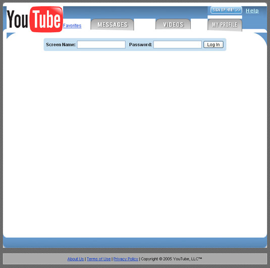
This is the earliest version I can find of youtube.com in May of 2005 is obviously incomplete. But it does show how they attempted to first put their concept into a design form.
June 2005
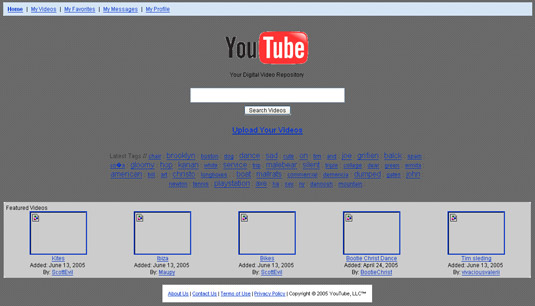
The next version appears around a month later in June 2005 and shows how they still weren't sure about how to bring their idea to the web. This design ironically looks like it was inspired by Google.com with the top search bar and simplistic form (spooky).
July 2005
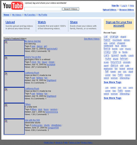
One more month and it takes on a very familiar form, and one that would ultimatly grant it success. One thing you'll notice is that they are still clinging onto a deli.cio.us style tag cloud system (which I guess never worked out)
Aug 2005
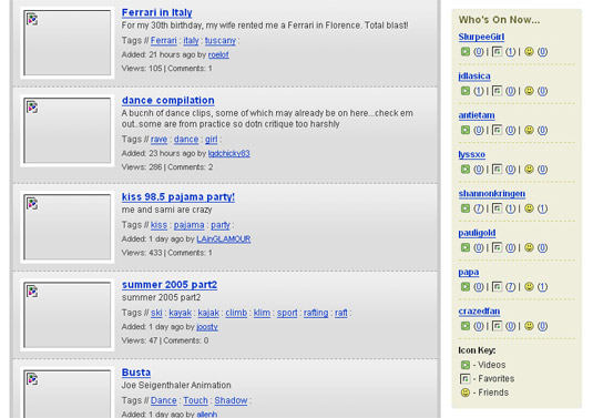
Throughout august 2005 nothing much changes with the overall layout but they add a strange "Who else is online" feature to the right column.
Sep 2005
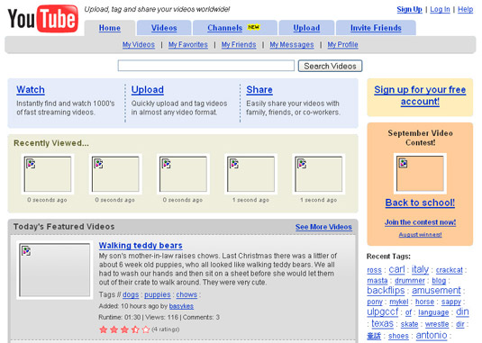
Now this is were is settles down, maybe they are beginning to realise that they are onto something good with this format. As you can see they have started to experiment with various features including competitions and recently viewed videos. This is also the earliest point I can find where they have added thier *New* Channels feature.
I guess the only question I can leave you pondering over is after looking at the way YouTube's design (grew up) what do you think was the real driving force behind its success? The fact it was a great concept or was this one of the biggest web design flukes ever?

No comments:
Post a Comment